
A website that doesn't move looks closed for business.
Walk past a shop with the lights off and the shutters down. You don't read the sign. You don't check the prices. You assume it's gone. In 2026, a flat, static website triggers the same instinct online — before a single word is read, the visitor has already decided whether anyone is home.
Motion is no longer decoration. It's the first signal of competence a brand sends. And most companies are still sending the wrong one.
Why 2026 is the line in the sand
Three things converged. Screens got fast — 120Hz is now standard on the phone in your pocket, and the eye notices when something stutters. Tools got cheap — what used to take a five-person motion team for a quarter now takes a small studio three weeks. And expectations got reset — every app your customer touches all day, from their banking to their messaging, moves with intent.
So when they land on a page that just sits there, the contrast is brutal. It doesn't read as "minimal." It reads as "unfinished."
Motion does three jobs at once
Done well, animation isn't a layer you add on top. It's how the page does its actual work:
It directs attention. The eye follows movement before it reads text. A well-timed reveal tells the visitor where to look and in what order — you're choreographing the read, not hoping for it.
It communicates quality. Smooth, considered motion is the digital equivalent of a heavy door that closes with a soft click. It says: someone cared about the details you can't quite name.
It carries meaning. A transition that shows where a panel came from, a scroll that unfolds an idea instead of dumping it — motion turns a flat layout into a narrative the visitor moves through.
The trap: motion that announces itself
There's a reason most animated sites feel cheap. They confuse movement with motion. Things spin because they can. Elements fly in from every edge. Parallax fights the scroll. The visitor notices the effect instead of the message — and noticing the effect means the effect failed.
The best motion is invisible. You don't watch it; you feel that the page is alive and you trust it more for reasons you'd struggle to articulate. That restraint is the entire craft. Anyone can make things move. The discipline is knowing what shouldn't.
What this looks like, in practice
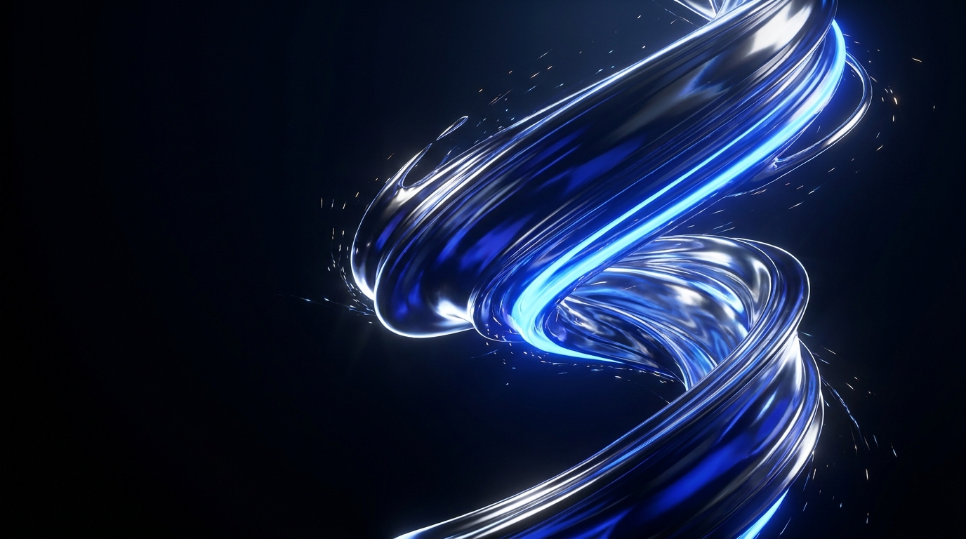
The site you're reading this on is the argument. The hero isn't a static image — it's a living aurora rendered in real time. Scroll and the story doesn't just appear, it travels: a camera moving through ideas, pinned so you read at the pace the narrative wants. Nothing shouts. Everything moves with a reason.
That's the standard we hold for every premium build: motion that earns its place, runs at sixty frames without compromise, and respects anyone who's asked their device to reduce it. Performance and restraint aren't constraints on the craft. They are the craft.
The takeaway for 2026
If your website doesn't move, you're not playing it safe — you're sending a signal you didn't mean to send. The question isn't whether to add motion. It's whether yours is doing real work, or just spinning to fill the silence.
Stillness used to read as elegant. In 2026, it reads as absent. Make sure the lights are on.
- Motion
- Animation
- Web Design
- 2026
- UX