
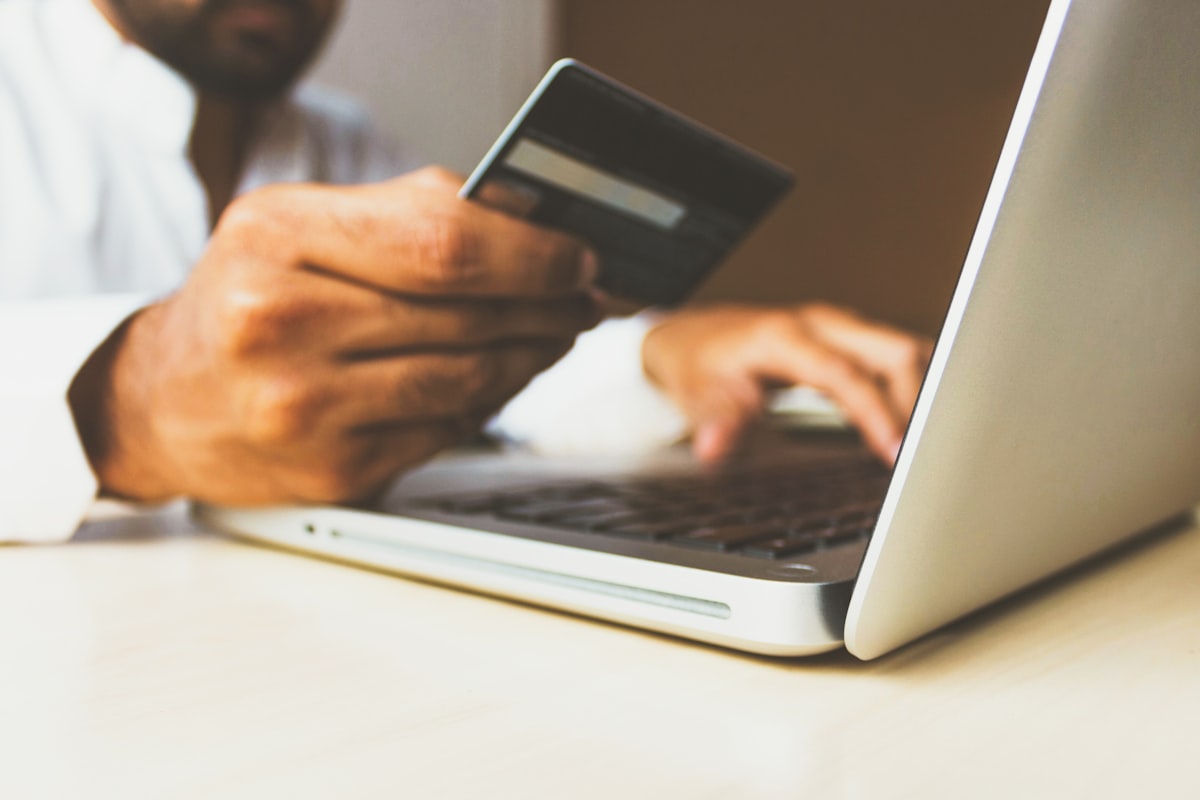
You have done the hard part. Someone found your shop, browsed your products, liked what they saw and added something to their basket. Then they left. Across the industry, roughly seven in ten online baskets are abandoned before payment — and for most Cyprus shops we look at, the problem is not the product or the price. It is the checkout.
The good news is that checkout problems are usually cheap to fix. Here are the ones we see most often on Cypriot e-commerce sites, and what to do about each.
1. You force people to create an account
Asking a first-time buyer to register before they can pay is the single most reliable way to lose them. They came to buy a pair of shoes, not to join something. Registration means inventing a password, waiting for a verification email, and handing over their details to a shop they have used exactly once.
Offer guest checkout. You can still invite them to create an account after the order is placed, when they already trust you and the only thing standing between them and an account is one click on a password field.
2. Shipping costs appear at the last second
Unexpected costs at the final step are the most-cited reason people abandon a basket, and Cyprus makes this harder than most markets. Delivery to Nicosia, delivery to a village outside Paphos, and delivery to Greece or the UK are genuinely different costs — so many shops hide the number until the end rather than explain it.
That is backwards. Put shipping costs where people can see them early: on the product page, in the basket, or as a simple table on a dedicated delivery page. If you can afford free delivery above a threshold, say so in a banner. A shopper who knows delivery is €4 is far more likely to buy than one who suspects it might be €15.
3. Your checkout asks for too much
Every field is a small reason to give up. Look at your checkout form honestly and ask what each field is actually for. Do you need a company name from a private customer? A second address line? A date of birth?
Cut anything you will not use. For the fields that remain, make them easy: let the browser autofill them, use the right keyboard on mobile (a numeric keypad for the phone number), and validate as people type rather than dumping five red errors on them after they press Pay.
4. It does not work properly on a phone
Most of your traffic is on mobile. Yet checkout is often the least-tested part of a site on a small screen, because the people who built it tested it on a laptop. Buttons end up too small, the card form zooms awkwardly, the total scrolls out of view.
Do this today: take your own phone, buy something from your own shop, and pay with a real card. Not a test card — a real one. You will find at least one thing that annoys you, and whatever annoys you annoys your customers ten times more, because they have less patience and no reason to persevere.
5. The payment options do not match how Cypriots pay
Card payment is a given, but it is not the whole picture. Some customers want Apple Pay or Google Pay because it saves them digging out a card. Some want to pay on delivery, which still carries real weight here, particularly for older customers and for higher-value orders from shops they do not know yet.
You do not need every method. You need the two or three your specific customers actually use — and the way to find out is to ask them, or to look at what your competitors offer.
6. You give no reason to trust you
A shopper about to type their card number is making a small leap of faith. Help them make it:
- Show a real physical address and a phone number that a human answers.
- Publish your returns policy in plain language, and make it findable from the checkout itself.
- Display the card logos and your secure-payment badge near the Pay button, where the doubt actually lives.
- Put a delivery estimate on the confirmation step, so nobody is left wondering when their order arrives.
These signals cost nothing and remove the quiet worry that stops a purchase halfway through.
Where to start
Do not try to fix all six at once. Open your analytics, find the step where most people drop out, and fix that one thing first. Then measure for a fortnight before touching anything else — otherwise you will never know which change did the work.
Checkout optimisation is not glamorous. There is no new design to admire at the end of it. But it is among the highest-return work available to most online shops, because you are not buying new visitors — you are keeping the ones you already paid for.
If you would like a second pair of eyes on your checkout, get in touch. We are happy to walk through it with you.
- e-commerce
- conversion
- checkout
- cyprus
- ux
Want this handled for you?
DigitalMove builds premium websites, ships AI systems and consultation, and runs SEO that compounds for Cyprus businesses. Tell us about your project — we reply within one business day.